press + brand
press kit.
use us right.
download logos, color tokens, type stacks, and voice rules for the roastery design system. dark roast is default; light roast is the cream alternate. free to use under the conditions on this page.
in one paragraph
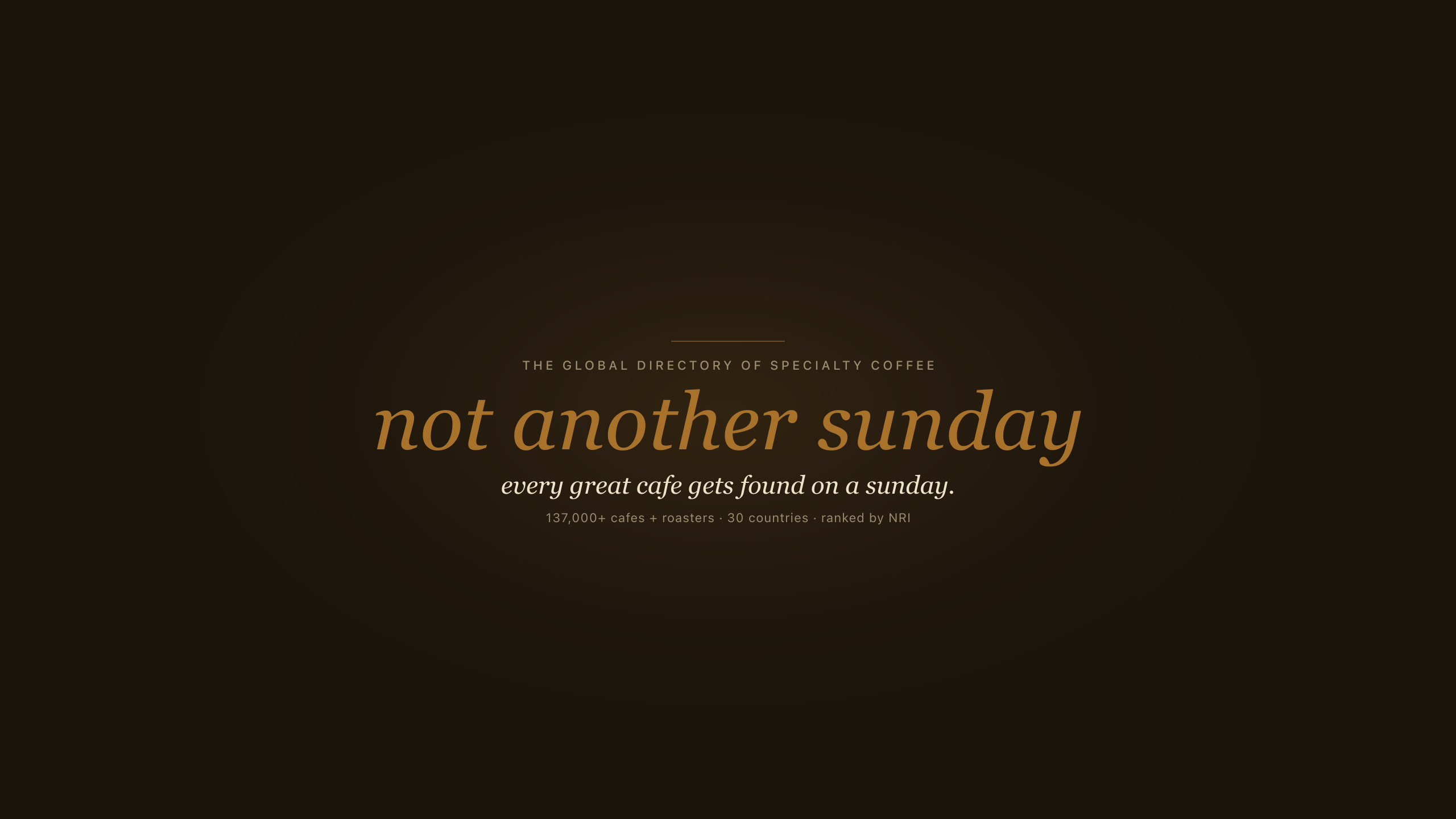
not another sunday is the global directory of specialty coffee. 137,000+ independent cafes and roasters across 30 countries, ranked by the natural ranking index (nri) - a merit-based score that combines review quality, review volume, social momentum, web presence, photo coverage, profile depth, and local credibility. no chains in default views. no paid placement that moves rankings. founded 2026, headquartered in london, run by editor gautam khorana.
wordmarks + monogram
download as svg. Instrument Serif italic at any size when the font is installed - get it from google fonts. georgia italic is the system fallback for print and email.

wordmark - gold on dark
default. use on dark roast surfaces (web, social, dark print).

wordmark - ink on dark
one-color reproductions on dark when gold isn't available.

wordmark - gold on cream
light roast theme or editorial press on cream paper.

wordmark - ink on light
monochrome reproductions on light.

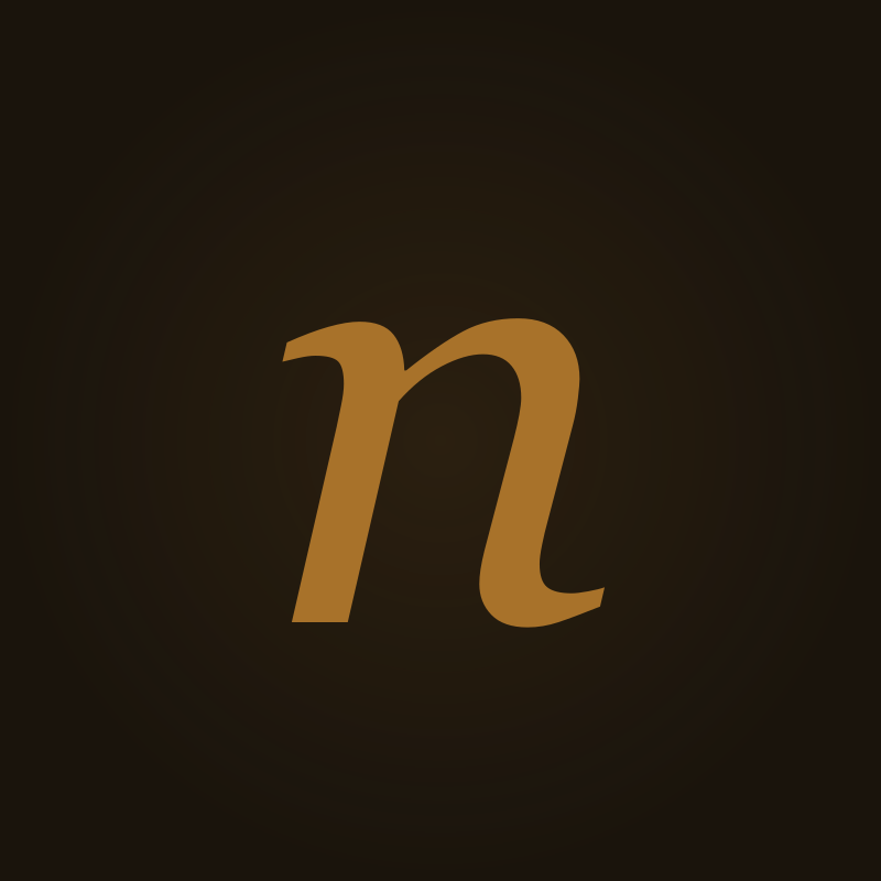
monogram - n
tight-space mark. social avatars, app icons, favicon.
featured badge
for partner sites. gold outline, surface fill.
how to use the wordmark
- · keep clear space equal to the height of the italic n on all four sides
- · minimum width 120px on screen, 25mm in print
- · never recolor outside the palette below - gold only on the wordmark itself
- · never stretch, skew, rotate, or add drop shadows
- · never set the wordmark in any font other than Instrument Serif italic
- · never uppercase it
youtube channel art
two assets for the channel: a 2560×1440 banner and an 800×800 channel logo on dark roast (#0F0D0A). download svg (canonical); re-export png from svg for youtube studio upload if needed.
channel description
txtnot another sunday is the global directory of specialty coffee. 137,000+ independent cafes and roasters across 30 countries, ranked by the natural ranking index. a merit-based score that combines review quality, review volume, social momentum, web presence, photo coverage, profile depth, and local credibility. no chains in default views. no paid placement that moves rankings. on this channel: cafe visits, roaster tours, the people behind the bar, and the cities where third wave coffee actually lives. shot in person, no scripts, no jump cuts disguising a thin idea. founded 2026, headquartered in london, run by editor gautam khorana. find every cafe at notanothersunday.com. claim your listing free at notanothersunday.com/claim. press kit at notanothersunday.com/press.
color
two themes: dark roast (default, near-black) and light roast (cream ground, dark ink). tokens are oklch-tuned for 7:1 body contrast. gold is rationed - see rules below.
gold rationing
- · gold is for the wordmark, primary cta buttons, and data scores (nri, stats, prices) - nothing else.
- · body copy uses ink 2. labels and eyebrows use ink 3 in spline sans mono.
- · nri meter tracks are ink or line - not gold. only the number glows gold.
- · elite/featured badges are gold outline chips, not filled gold pills.
- · never set paragraphs, nav links, or section headers in gold.
dark roast - default
bg
#0F0D0A
the floor. near-black ground on every page.
surface
#1A1610
cards, panels. +6% elevation over bg.
ink
#ECE5D8
headlines, primary foreground. 13:1 on bg.
ink 2
#BFB4A3
body copy. 7:1 on bg - never tint body gold.
ink 3
#948A7C
labels, meta, eyebrows. spline sans mono.
gold
#D2A755
wordmark, primary cta, nri/data numbers only.
gold ink
#0F0D0A
text on gold buttons.
border
#3A3530
hairlines, card edges.
light roast - optional cream theme
bg
#F5F2EA
surface
#FDFCFA
ink
#2E2418
ink 2
#5C5044
ink 3
#7A6F62
gold
#9A7428
border
#D9D0C4
typography
Instrument Serif
google fontsdisplay + headlines ≥28px
every great cafe gets found on a sunday.
italic only at display sizes. never for body or small ui text.
Instrument Sans
google fontsbody + ui + buttons
the global directory of specialty coffee.
weights 400 (body), 500 (medium), 600 (emphasis). all lowercase in product ui.
Spline Sans Mono
google fontsdata + labels + eyebrows
nri 87 · local cred 92%
every score, price, breadcrumb, filter chip, and .label eyebrow. ink 3 color.
voice + tone
editorial, sensory, opinionated. always first-person when the editor writes. specific over generic. references: apartamento, drift, monocle, the early wallpaper era. never sprudge irony, never trade-journal grey, never saas-cream.
do
- · lowercase for ui, brand, all surfaces. no exceptions.
- · specific over generic. name the moment, name the bean, name the second.
- · first person when the editor writes. "i sat down at the bar."
- · sensory. the steam, the queue, the morning chill.
- · opinionated. recommend a top pick, don't list everything.
don't
- · no em-dashes anywhere. use commas, colons, periods.
- · no emoji. ever.
- · no SaaS-cream: comprehensive, leverage, robust, seamless, world-class, best-in-class, in today's landscape, navigate, delve, unlock potential.
- · no uppercase wordmarks or headlines.
- · no "AI-generated" cadence - vary sentence length, drop articles where it earns specificity.
photography
polaroid aesthetic
white border, soft shadow, slight rotation, hand-written caption typography. used exclusively for in-person editor visits. signals \“the editor was actually here\”.
editorial hero
wide, natural light, no people. focus on the bar, the cup, the room as a still life. used for listing heroes and journal long-reads.
iconography
lucideonly. 1.5px stroke. outline never filled. never raster. never emoji. when you cite us, match this convention or our brand starts to look like everyone else's.
terms of use
- editorial press: use the wordmark + name freely when writing about not another sunday. credit as not another sunday on first mention.
- partner pages, media kits, slide decks: use freely. don't imply endorsement we haven't given.
- commercial use: ask first - hey@notanothersunday.com.
- linking: always link to www.notanothersunday.com on first mention. no nofollow attributes on editorial mentions please.
- image use from listings: photos on listing pages may be owner-supplied, google places sourced, or editor-shot. don't reuse without checking source.
press contact
writing about us? ask anything.
interviews, data requests, embargoed coverage, founder quotes, custom assets. the editor reads every press email.
hey@notanothersunday.comresponse within two working days.